There are infinite different ways to judge whether pupils at a school achieved more or less than they might have if placed at another school chosen at random. Tom Sherrington has chosen to criticise one – Progress 8 – in his blog and propose another – a comparison of the distribution of attainment by intake and by outcomes.
Both these measures belong to the class of simple value-added measures, accounting for baseline attainment of intakes but not the social circumstances in which the school operates. The result is that grammar schools and other schools that draw intakes from affluent neighbourhoods will, on average, add the most value or show the most progress. In a blog later this week we will discuss the difficulties of fairly comparing schools in different social circumstances.
Tom makes some very sensible concluding remarks in his blog that hold true for all value-added measures, not just Progress 8:
- don’t read too much into imprecise estimates
- don’t try boiling down school performance to a single number
- look at within-school variation
However, we disagree with some of the arguments with which he precedes his conclusions. We would argue that it is unfair to describe Progress 8 as:
We will leave discussion of confidence intervals and of value-added bias for separate posts, addressing his main criticisms here.
Tom’s criticism 1: He claims Progress 8 uses a single input measure where ‘raw marks in different subjects are to the put through a convoluted mincing machine where 74 and 77 = 5.1’. All simple value-added measures use a single input measure, including his proposed distributional charts. The only relevant information here is that a maths and English score are weighted equally. The fact that the marks are converted onto a scale without respecting the different ‘size’ in terms of learning matters little since the mapping of KS2 fine grades onto Attainment 8 GCSE grades is entirely non-linear. We’d prefer to use a factor analysis of the underlying paper marks or model the relationship between KS2 subjects and Attainment 8 more explicitly to choose the subject weightings, but it is doubtful that it would affect the value of Progress 8 much.
Tom’s distrust of KS2 fine grades leads him to propose deciles or similar for his distributional chart. No problem, but it wouldn’t change the nature of the value-added measure. Fine grades are useful because they should allow comparability between pupils tested in different years, whereas a mark of 76 may indicate a higher level of learning in one year than another. But fine grades do not need to be used. As an alternative, let’s calculate the fractional percentile for each pupil in English and maths at KS2 based on raw marks. Let’s then calculate the average for each pupil and divide pupils into 20 evenly-sized vintiles. We’ll use the vintiles to calculate alternative estimates and therefore an alternative P8 measure for each school. Unsurprisingly, the alternative correlates strongly with the original (r=0.9999).
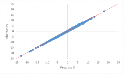
The scores for most schools hardly change. Less than 10% change by more than 0.3 points (n.b. we haven’t divided the Progress 8 scores by 10 as DfE do). 2 schools change by more than 1 point. These are schools with very high ability intakes (a lot of pupils with a KS2 fine grade of 5.6 or higher). The vintile method under-predicts for this group and so risks introducing an unintended bias in favour of schools with very high ability intakes. As indeed would Tom’s 10 deciles method. The difference in the outcomes between the ‘top’ and ‘bottom’ of the highest decile is far greater than the difference in outcomes between the ‘top’ and ‘bottom’ of any of the middle deciles. The use of fine grades alleviates this to some extent.
Tom’s criticism 2: The look-up table that converts KS2 fine grades into expected Attainment 8 scores reports 4 significant figures. Tom is correct that further rounding would be needed to avoid misleadingly precise reporting of a computed number, if this were reporting the final measure following a series of calculations. The table does nothing of the sort: it is an intermediary look-up table that will be then used to aggregate a school-level Progress 8 score from a set of pupil data. We must use 4 significant figures to minimise the amount of round-off error in the final reported result. The final reported school-level metric is indeed rounded to 1 decimal place to reflect the relatively low degree of precision of the estimate. Moreover, some of the outcome scores for exams that could be counted in Attainment 8 are actually measured to 2 decimal places. A grade BC in a double AS level is worth 7.63 points. So there will be some pupils who genuinely have actual outcome scores measured to 4 significant figures.
Tom’s criticism 3: He says ‘Attainment 8 un-controversially adds up point scores for GCSE grades, arbitrarily giving extra weight to maths and English’. If we want a single value-added measure for a school then we must sum across a set of subjects the pupil took. We have already blogged about value-judgements in turning GCSE grades into points. The inclusion and exclusion of individual subjects is designed to incentivise schools towards teaching a more traditional curriculum, for better or worse. We have some sympathy with Tom that the double-weighting of maths and English makes no sense: if English is so important then pupils should sit English Literature and English Language, each counting once; if maths is so important then pupils should follow a curriculum that leads to two qualifications, ideally with a healthy dose of statistics in there.
Tom’s idea of charting the distribution of intakes and outcomes at a school is nice, though not new. It could be improved by showing the number of pupils in each decile- numbers in some deciles will be very small in many schools. The importance of knowing whether your school is strong in a particular part of attainment distribution was addressed by work we completed with Simon Burgess over 5 years’ ago and was taken up in the 2012 performance table reforms. Tom’s chart necessarily contains more information on a school’s performance than a single number. In fact, there is no reason why additional Progress 8 data could not be presented using the sort of chart Tom proposes. Whether this should be published in Performance Tables for public consumption or RAISEonline for schools’ consumption can be debated.
Of course Progress 8 isn’t a perfect summary of school performance; no single number can do this. We are putting so many competing demands on the measure:
- Being understandable to non-technical audiences, particularly politicians
- Recognising the complexity of how pupils make progress from KS2 to KS4
- Driving the behaviour that really matters for pupils, parents and teachers, removing incentives to focus on narrow segments of pupils (e.g. C/D borderline)
- Encouraging schools to deliver a curriculum that politicians desire for as many pupils as possible
- Being as fair as possible to schools of all types
But surely we all agree that Progress 8 is far, far better than the % 5+ A*-C it replaces?
Leave A Comment